
Have you ever asked yourself, “Self, how come the image color on my print, doesn’t match what my screen displays”?
Color management is the key, and it makes a huge difference as to how your screen dreams become reliably predictable in print production.
If you’ve ever scrolled through your monitor settings, whether you use a PC or a Mac, there’s a section that allows you set your rendering intent using ICC color profiles. Some computers and operating systems have a self-calibration function located in your “Display settings,” “Color settings,” etc.
This is where you can choose your rendering intent, as most monitors don’t have the ability to reflect accurate color reproduction on print media without a color profile that closely matches an ICC standard. Without them, you can’t accurately render color in the color space that all printed materials use — i.e., viewing RGB monitor colors compared to the CMYK+ printing ink color space.
Monitor calibrations can be done using some simple tools and color profiling. Anyone who operates commercial printing equipment has created custom color profiles to accurately render color intent for production. If you create a custom monitor ICC profile, you’ll find that your monitor will properly display what a print product will actually end up looking like.
Let’s move on to another color control point.
Say you’re designing a product with a photograph that was taken with a cell phone camera, and the image looks . . . flat. Or maybe the lighting was just unfavorable.
There are a few cool things you can do to the image to bring it back to life and go from dull to vibrant with contrast.
All photos captured by cameras or scanning devices are primarily RGB color mode. This mode offers the easiest color manipulation. My favorite corrections are made using Photoshop’s “Levels.” Levels displays what looks like a sound wave but is actually called a histogram. This is an example of a histogram:
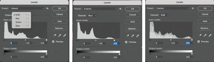
You want to toggle from color to color, using the sliders to bring the points to the edge of the histogram. Sometimes it’s the highlights, or the shadow side of the histogram, or both. Once the sliders are properly set, you can toggle back to all RGB colors and you’ll notice that the histogram has filled the whole area. By selecting and adjusting each color vs. all three at once, you can correct grey balance. Brightness and contrast can be adjusted by using the center slider.
If you don’t have Photoshop, there are other methods for correcting color. The point is to recognize how your monitor displays a color vs. what the color will look like when printed to a CMYK+ inkjet printer or printing press.
We’re happy to delve into more details on this topic, or any other topics in this blog. Any questions, please contact us.