• Skip to primary navigation
  • Skip to main content
Black Creek Signs

Black Creek Signs

  • BLOG
  • ABOUT US
    • ABOUT US
    • OUR STORY
  • OUR WORK
    • OUR WORK
    • TESTIMONIALS
  • PRODUCTS
  • SPECIALS
  • CONTACT US
  • MY ACCOUNT
You are here: Home / Archives for Helpful Tips

Helpful Tips

Printer Ink Technology

June 23, 2025

We want to define the various printing ink technologies and how they affect your signage projects. Ink technology has changed extensively over the past 20 years for large format inkjet printers and the sign industry. We’re deliberately omitting discussion of digital printers, those that are laser class or use heat thermo technologies.

Back in the day, signs were either painted using pounce patterns and enamel paints, or using an aqueous ink printer that created poster prints when could then be adhered to sign faces like wallpaper, using a paste roll-on glue.

Modern signs are now created with either direct print to substrates or vinyl prints with UV over-laminates.

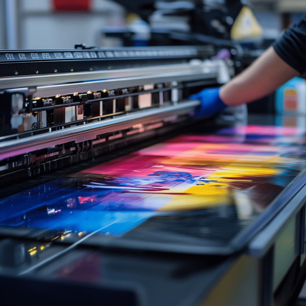
This is where the rubber meets the road with ink technologies. There are three unique technologies used by sign companies, with most having all three capabilities. The three we’ll discuss are UV (ultra-violet) ink, eco-solvent ink, and aqueous ink technologies.

UV Ink Technology

Let’s dive into UV ink technology first. Printing equipment using UV ink is primarily designed for direct print to substrates like coroplast, aluminum, DiBond, acrylic, and even certain roll products.

What makes this technology unique is its curing capability. What many don’t realize is that this ink does not dry, it’s cured, using high intensity UV lamps that molecularly change the ink from a liquid to a solid.

You can think of it on a microscopic level: the ink droplet is exposed to the UV light and the structure creates a spiked molecule in which the molecules bond to each other and to the material it’s cured on. Curing is an instantaneous reaction. The print is safe and solid to the touch once exposed to the UV lamps.

Eco-Solvent Ink Technology

The second ink technology is eco-solvent. It’s complex and used primarily on products like wrap vinyl, decals, banners, and other types of roll materials.

The principle behind this technology is based on the solid color pigments suspended in a solvent to make it possible to flow micro-picoliter inkjet droplets.

Eco-solvent printers use three separate heaters: first, a pre-heat that warms the media in order to open the pores of the material being printed on; the second heater is the platen heater, which is warmer than the pre-heat, and further opens the pores in the material to receive the solid color pigment and embed those solid particles; the third heater is the dryer heater, which is usually considerably hotter than the other two heaters that assist in flashing off the solvent, leaving just the solid pigment on the material.

Aqueous Ink Technology

The third ink is the one most anyone with a home color printer has: those printers use aqueous ink.

Aqueous ink produces a more finite dot, as compared to the previous two ink technologies. Aqueous inks allow you to generate truly photo-realistic prints.

The paper that’s used is the key, as it has a coating to receive the ink and bond, instead of staying liquid. You see commercial usage of aqueous prints in things like movie theater posters, or for high-end event signage on stanchion frames.

Aqueous ink technology excels at photo realistic results. Its only downside? It’s just not optimal for use outdoors. Lamination will keep it dry and partly protected, but humidity or sun exposure will degrade the ink rapidly, starting with magenta.

Recommendations

At Black Creek Signs, we’ve used many varieties of each of these ink technologies over the years.

  1. Aqueous ink is perfect for high-end large format printing or anything you want to keep and display indoors, or put in a file cabinet.
  2. If you want a vehicle wrap or decals, go with eco-solvent ink.
  3. If you can get direct print rigid substrates like coroplast or aluminum, UV ink is the way to go.

If you found this post interesting and wanting more details, please contact us anytime.

Color Reproduction Tips

May 27, 2025

Have you ever asked yourself, “Self, how come the image color on my print, doesn’t match what my screen displays”?

Color management is the key, and it makes a huge difference as to how your screen dreams become reliably predictable in print production.

If you’ve ever scrolled through your monitor settings, whether you use a PC or a Mac, there’s a section that allows you set your rendering intent using ICC color profiles. Some computers and operating systems have a self-calibration function located in your “Display settings,” “Color settings,” etc.

This is where you can choose your rendering intent, as most monitors don’t have the ability to reflect accurate color reproduction on print media without a color profile that closely matches an ICC standard. Without them, you can’t accurately render color in the color space that all printed materials use — i.e., viewing RGB monitor colors compared to the CMYK+ printing ink color space.

Monitor calibrations can be done using some simple tools and color profiling. Anyone who operates commercial printing equipment has created custom color profiles to accurately render color intent for production. If you create a custom monitor ICC profile, you’ll find that your monitor will properly display what a print product will actually end up looking like.

Let’s move on to another color control point.

Say you’re designing a product with a photograph that was taken with a cell phone camera, and the image looks . . . flat. Or maybe the lighting was just unfavorable.

There are a few cool things you can do to the image to bring it back to life and go from dull to vibrant with contrast.

All photos captured by cameras or scanning devices are primarily RGB color mode. This mode offers the easiest color manipulation. My favorite corrections are made using Photoshop’s “Levels.” Levels displays what looks like a sound wave but is actually called a histogram. This is an example of a histogram:

You want to toggle from color to color, using the sliders to bring the points to the edge of the histogram. Sometimes it’s the highlights, or the shadow side of the histogram, or both. Once the sliders are properly set, you can toggle back to all RGB colors and you’ll notice that the histogram has filled the whole area. By selecting and adjusting each color vs. all three at once, you can correct grey balance. Brightness and contrast can be adjusted by using the center slider.

If you don’t have Photoshop, there are other methods for correcting color. The point is to recognize how your monitor displays a color vs. what the color will look like when printed to a CMYK+ inkjet printer or printing press.

We’re happy to delve into more details on this topic, or any other topics in this blog. Any questions, please contact us.

Signs With Impact!

May 21, 2025

In the dizzying world of signage displays, there are certain critically important standards that some designers may forget to consider.

I coined a phrase 20 years ago, as Operations Manager for a large sign company. The phrase? “View Factor” or V-factor.

Never Forget Your Sign’s View Factor (V-Factor)!

Assume your sign is statically placed, meaning it doesn’t move. How is your sign being viewed? From what angle? From a roadway? If so, how far from the thoroughfare is your sign being viewed? What’s the speed limit for the street or highway where your sign/message is displayed? What message is being conveyed to people passing your sign?

If your sign’s in a window in a shop with other shops around it, are pedestrians your main viewers, or pedestrians and road traffic? In an indoor mall, for example, you’re not getting cars driving by — you’re getting foot traffic. That’s your V-factor. If your sign’s a billboard off a freeway with a speed limit of 75 mph, your sign is being viewed from vehicles whizzing past in traffic and you’ve got to consider the V-Factor for that specific situation.

Here are some of the most common mistakes designers and art directors make when designing their display message.

Designing for Aesthetics Instead of Impact

What is impact, you ask? Impact is the core of your message. In sales, it’s most likely the sale bargain i.e.: “50% OFF,” “BOGO – Buy One Get One,” or perhaps it’s a “One Day Only” sale. This is your impact.

Many designers want their logos featured as the impact message of their sign, but if they choose a color scheme that’s too busy, the impact disappears as minutiae.

With this in mind, as you drive around on your daily routine, start noticing which signs grab your attention and what is it about them, specifically, that made an impact on you. For example, phone numbers on stand-alone signs should pop: if not, how do you contact them? Is it the email address or website address that stands out? Your logo is brand recognition, sure, but if your logo is the featured element on your sign, make sure you also emphasize your impact point, and consider the V-Factor! Do this for all your signage and get the most bang for your buck.

Contact us with your thoughts. Let’s partner with you for signs with IMPACT.

Signs On The Fly?

May 14, 2025

The phrase can conjure many interpretations and most all would be true.

Here are just a couple of examples we’ve come across in our decades in the sign business that help define this term.

Sometimes you need a sign on the FLY.

Have you ever had to organize an event on short notice? A birthday party, wedding, crawfish boil, church event, fundraiser, or any other celebration or holiday? Have you ever needed “directional” signage? Think of the possibilities!

Or, maybe you applied to be a vendor at a festival, convention, or trade show, at the last minute, and now you need display products — and fast. Whether it’s business cards, retractable banner stands, magnetic or velcro-backed polyester prints to attach to a display system . . . Black Creek Signs has you covered! Maybe you need decals for your company and/or product. Swag for your attendees? People love swag. Merch.

In many cases, we’ve had realtors who are under contractual deadlines and suddenly find they need additional aluminum signs with steel frames to promote their listing. Sometimes the listings are acreage, and require larger MDO sign panel signage so that, when people drive past, it pops, and is noticeable so it stands out among a sea of other developer-realtor-construction signage usually lining the frontage of such parcels.

We’ve all seen a mess of signs on acreage that no one driving by would ever notice, much less remember reading!

What to do?

You need a print partner who not only understands the industry but also knows how to expedite a production cycle that works with your schedule.

Black Creek Signs has a long history of handling many quick-turn-around solutions for many clients over the years in a timely manner.

If you have any questions or comments, please contact us whether you’re an existing long-time client or new at this. We can certainly help you accomplish your display goals!

Black Creek Signs

Copyright © 2025 by Black Creek Signs · All Rights Reserved.

  • PRIVACY POLICY